We will look at some of the most practical and commonly used utilities in Bootstrap 5. If you have been constructing layouts and components, this is the moment you have been waiting for; you will encounter the utilities that professional developers use every day to create a responsive, flexible, and visually appealing webpage.
In this tutorial, you will discover how to:
These are not “nice-to-have” features; these are the essential building blocks that every web project utilizes along the way no matter what you’re building. Whether you are constructing a portfolio, a dashboard, or an e-commerce site, working with utilities will speed your development and professionalism.
Now, let’s get started and build something great!
Prerequisites
Before getting started, please confirm you have:
Then we will start with a blank slate and we will include Bootstrap 5.
<title>Bootstrap Utilities Master Class</title>
<!-- Bootstrap 5 CSS -->
<div class="container">
<h1 class="text-center mb-4">Bootstrap Day 6: Utilities & Components</h1>
<!-- All our examples will go here -->
</div>
<!-- Bootstrap 5 JavaScript Bundle -->
What’s Happening Here?
Pro Tip: The viewport meta tag is extremely important for responsive design because it tells mobile browsers to render it at whatever the device’s real width is rather than zoom out.
Flexbox is a great layout utility because it allows you to easily align and space your elements, and Bootstrap provides utility classes that make using Flexbox extremely straightforward.
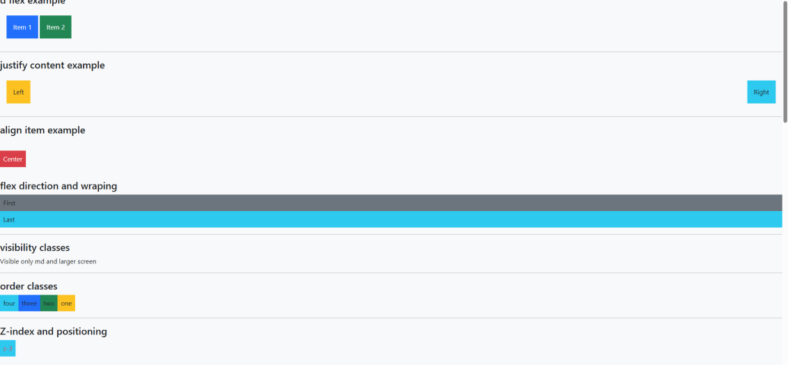
Basic Flexbox Display
<h4>Basic Flexbox Example</h4>
<div class="d-flex bg-white p-3 mb-3">
<div class="p-3 bg-primary text-white">Item 1</div>
<div class="p-3 bg-success text-white">Item 2</div>
<div class="p-3 bg-danger text-white">Item 3</div>
</div>
Here are examples of the classes:
Why use flexbox? Without d-flex, these three items would stack vertically (block behavior). With d-flex applied, the three items now line up horizontally in a row–perfect for use in navigation, card layouts, toolbars, etc.!
The justify-content classes will determine how flex items will layout/be spaced out horizontally in the main axis.
<h4>Justify Content Examples</h4>
<!-- Space Between -->
<div class="d-flex justify-content-between bg-white p-3 mb-3">
<div class="p-3 bg-warning text-dark">Left</div>
<div class="p-3 bg-info text-white">Right</div>
</div>
<!-- Center -->
<div class="d-flex justify-content-center bg-white p-3 mb-3">
<div class="p-3 bg-primary text-white">Centered</div>
</div>
<!-- Space Around -->
<div class="d-flex justify-content-around bg-white p-3 mb-3">
<div class="p-3 bg-success text-white">A</div>
<div class="p-3 bg-danger text-white">B</div>
<div class="p-3 bg-warning text-dark">C</div>
</div>
Explanation:
Justify Content Options:
Class | Effect |
justify-content-start | Items align to the left (default) |
justify-content-center | Items center horizontally |
justify-content-end | Items align to the right |
justify-content-between | Items spread out with space between (edges touch container) |
justify-content-around | Items spread out with equal space around each |
Real-World Use: If you want a logo to the left of the bar and the menu items to the right, justify-content-between is probably the best option!
The align-items classes manage aligning flex items vertically along the cross axis.
<h4>Align Items Example</h4>
<!-- Vertical Center -->
<div class="d-flex align-items-center bg-white p-3 mb-3" style="height: 150px">
<div class="p-3 bg-danger text-white">Vertically Centered</div>
</div>
<!-- Align to Bottom -->
<div class="d-flex align-items-end bg-white p-3 mb-3" style="height: 150px">
<div class="p-3 bg-success text-white">Bottom Aligned</div>
</div>
Explanation:
Align Items Options:
Class | Effect |
align-items-start | Items align to the top |
align-items-center | Items center vertically (very common!) |
align-items-end | Items align to the bottom |
align-items-stretch | Items stretch to fill container height (default) |
Pro Tip: If you combine justify-content-center and align-items-center, you get perfect centering (horizontally and vertically). This is the ideal solution for centering elements with CSS, and Bootstrap makes it so easy!
These properties manage the direction of flex items, as well as if they wrap or not.
<h4>Flex Direction and Wrapping</h4>
<!-- Column Direction -->
<div class="d-flex flex-column bg-white p-3 mb-3">
<div class="p-2 bg-primary text-white">First</div>
<div class="p-2 bg-success text-white">Second</div>
<div class="p-2 bg-danger text-white">Third</div>
</div>
<!-- Reverse Column Direction -->
<div class="d-flex flex-column-reverse bg-white p-3 mb-3">
<div class="p-2 bg-info text-white">Last (appears first)</div>
<div class="p-2 bg-secondary text-white">First (appears last)</div>
</div>
<!-- Flex Wrap -->
<div class="d-flex flex-wrap bg-white p-3 mb-3">
<div class="p-3 bg-warning text-dark m-2" style="width: 150px">Box A</div>
<div class="p-3 bg-info text-white m-2" style="width: 150px">Box B</div>
<div class="p-3 bg-success text-white m-2" style="width: 150px">Box C</div>
<div class="p-3 bg-danger text-white m-2" style="width: 150px">Box D</div>
<div class="p-3 bg-primary text-white m-2" style="width: 150px">Box E</div>
</div>
Explanation:
Flex Direction Options:
Class | Effect |
flex-row | Items arranged horizontally (default) |
flex-row-reverse | Items arranged horizontally in reverse |
flex-column | Items arranged vertically (stacked) |
flex-column-reverse | Items arranged vertically in reverse |
Flex Wrap:
Use Case: flex-wrap is great for responsive card grids that will automatically move cards to a new row on smaller screens!
Bootstrap allows you to show/hide elements based on screen size, so you don’t have to write custom CSS!
<h4>Responsive Visibility</h4>
<!-- Visible only on medium screens and larger -->
<p class="d-none d-md-block bg-success text-white p-3">
✅ Visible only on tablets and larger (≥768px)
</p>
<!-- Visible only on small screens -->
<p class="d-block d-md-none bg-warning text-dark p-3">
📱 Visible only on mobile phones (<768px)
</p>
<!-- Hide on large screens -->
<p class="d-lg-none bg-info text-white p-3">
💻 Hidden on large screens (≥992px)
</p>
Explanation:
Display Breakpoints:
Breakpoint | Screen Width | Class Prefix |
Extra Small (xs) | <576px | (no prefix needed) |
Small (sm) | ≥576px | sm |
Medium (md) | ≥768px | md |
Large (lg) | ≥992px | lg |
Extra Large (xl) | ≥1200px | xl |
XXL | ≥1400px | xxl |
Common Patterns:
Real-use case: Hide the content-heavy sidebar on mobile but show on desktop, which is a great use-case for responsive navigation menus!
Change visual ordering of elements, but not HTML structure. This is incredibly useful for responsive design!
<h4>Order Classes</h4>
<div class="d-flex bg-white p-3 mb-3">
<div class="order-3 bg-warning text-dark p-3 m-1">One (order-3)</div>
<div class="order-1 bg-success text-white p-3 m-1">Two (order-1)</div>
<div class="order-2 bg-info text-white p-3 m-1">Three (order-2)</div>
</div>
<!-- Responsive Ordering -->
<div class="d-flex bg-white p-3 mb-3">
<div class="order-4 order-md-1 bg-primary text-white p-3 m-1">
First on desktop, last on mobile
</div>
<div class="order-1 order-md-2 bg-danger text-white p-3 m-1">
Second on desktop, first on mobile
</div>
</div>
Explanation:
Order Values: Order range from order-0 to order-5
Powerful Use Case: On a mobile device, you might want to show the main content first, then show the sidebar. On a desktop, you probably want the sidebar on the left and content on the right. Order classes enable you to do this without writing a single line of custom CSS.
These classes help you control stacking and positioning of elements for layered designs.
<h4>Z-Index and Positioning</h4>
<div class="position-relative bg-white p-3 mb-3" style="height: 150px">
<!-- Lower z-index (appears behind) -->
<div class="position-absolute top-0 start-0 bg-warning text-dark p-3 z-0">
z-0 (Behind)
</div>
<!-- Higher z-index (appears in front) -->
<div class="position-absolute top-0 start-0 bg-info text-white p-3 z-3">
z-3 (In Front)
</div>
</div>
Explanation:
Classes for Positioning:
Classes for Placement:
Z-Index Values: z-0, z-1, z-2, z-3 (more z-index value means it will appear on top)
Pro Tip: If you are ever using position-absolute on a child element, be sure to use position-relative on the parent element. This will establish a positioning context so the child element will position itself relative to its parent and not the entire page!
Make those boring HTML tables become an eyepopping and professional display of data.
<h4>Styled Tables</h4>
<!-- Basic Table with Multiple Styles -->
<table class="table table-bordered table-striped table-hover">
<thead class="table-dark">
<tr>
<th>#</th>
<th>Name</th>
<th>Age</th>
<th>Role</th>
</tr>
</thead>
<tbody>
<tr>
<td>1</td>
<td>Alice Johnson</td>
<td>28</td>
<td>Developer</td>
</tr>
<tr>
<td>2</td>
<td>Bob Smith</td>
<td>34</td>
<td>Designer</td>
</tr>
<tr>
<td>3</td>
<td>Carol White</td>
<td>25</td>
<td>Manager</td>
</tr>
<tr>
<td>4</td>
<td>David Brown</td>
<td>31</td>
<td>Analyst</td>
</tr>
</tbody>
</table>
<!-- Colored Table -->
<table class="table table-info table-striped">
<thead>
<tr>
<th>Product</th>
<th>Price</th>
<th>Stock</th>
</tr>
</thead>
<tbody>
<tr>
<td>Laptop</td>
<td>$999</td>
<td>15</td>
</tr>
<tr>
<td>Mouse</td>
<td>$25</td>
<td>50</td>
</tr>
</tbody>
</table>
Explanation:
Table Classes:
Class | Effect |
table | Basic Bootstrap table styling (required base class) |
table-striped | Alternating row colors (zebra stripes) |
table-bordered | Adds borders around all cells |
table-hover | Highlights rows on mouse hover |
table-sm | Makes table more compact (less padding) |
table-responsive | Makes table scrollable on small screens |
Color Variants:
Header Styling:
Best Practice: When working with long tables that have an extensive number of columns, always use the table-responsive wrapper:
<div class="table-responsive">
<table class="table">
<!-- table content -->
</table>
</div>
This prevents left and right overflow on mobile devices!
Make beautiful organized lists for navigation, settings, or any type of structured content.
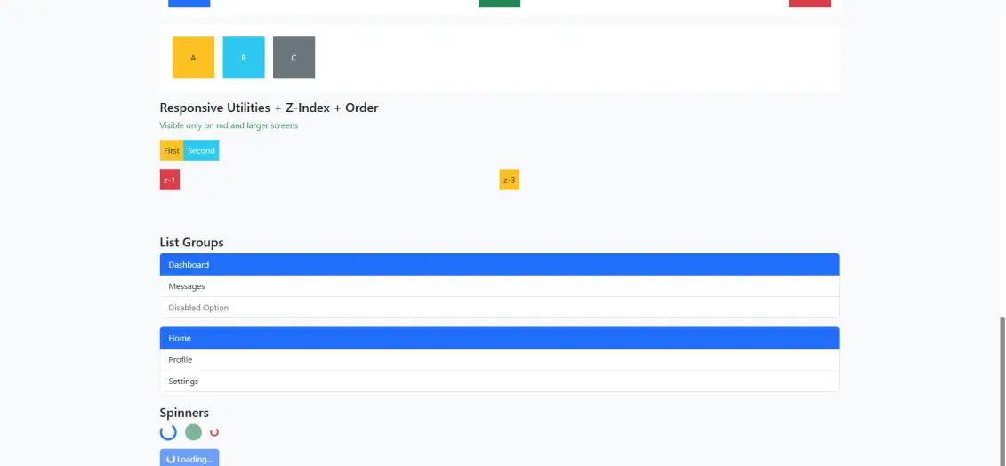
<h4>Basic List Groups</h4>
<!-- Simple List Group -->
<ul class="list-group mb-3">
<li class="list-group-item active">Dashboard</li>
<li class="list-group-item">Messages</li>
<li class="list-group-item">Profile</li>
<li class="list-group-item disabled">Settings (Disabled)</li>
</ul>
<!-- Actionable List Group (Links) -->
<div class="list-group mb-3">
<a href="#" class="list-group-item list-group-item-action active">
🏠 Home
</a>
<a href="#" class="list-group-item list-group-item-action">
👤 Profile
</a>
<a href="#" class="list-group-item list-group-item-action">
⚙️ Settings
</a>
<a href="#" class="list-group-item list-group-item-action">
📧 Messages
</a>
</div>
<!-- Colored List Items -->
<ul class="list-group mb-3">
<li class="list-group-item list-group-item-success">✅ Success message</li>
<li class="list-group-item list-group-item-warning">⚠️ Warning alert</li>
<li class="list-group-item list-group-item-danger">❌ Error occurred</li>
<li class="list-group-item list-group-item-info">ℹ️ Info notification</li>
</ul>
Explanation:
List Group Classes:
Class | Effect |
list-group | Container for list items |
list-group-item | Individual list item |
list-group-item-action | Makes item clickable with hover effects |
active | Highlights the current/selected item |
disabled | Grays out and disables an item |
Color Variants:
Key Differences:
Real-World Use: List groups are ideal for:
Integrate functioning loading indicators for a seamless user experience while fetching or processing data.
<h4>Spinners</h4>
<!-- Border Spinners -->
<div class="d-flex gap-3 mb-3">
<div class="spinner-border text-primary" role="status">
<span class="visually-hidden">Loading...</span>
</div>
<div class="spinner-border text-success" role="status">
<span class="visually-hidden">Loading...</span>
</div>
<div class="spinner-border text-danger" role="status">
<span class="visually-hidden">Loading...</span>
</div>
</div>
<!-- Growing Spinners -->
<div class="d-flex gap-3 mb-3">
<div class="spinner-grow text-primary" role="status">
<span class="visually-hidden">Loading...</span>
</div>
<div class="spinner-grow text-success" role="status">
<span class="visually-hidden">Loading...</span>
</div>
<div class="spinner-grow text-warning" role="status">
<span class="visually-hidden">Loading...</span>
</div>
</div>
<!-- Small Spinners -->
<div class="d-flex gap-3 mb-3">
<div class="spinner-border spinner-border-sm text-info"></div>
<div class="spinner-grow spinner-grow-sm text-danger"></div>
</div>
<!-- Spinner in Button -->
<button class="btn btn-primary" disabled>
<span class="spinner-border spinner-border-sm" role="status"></span>
Loading...
</button>
<button class="btn btn-success" disabled>
<span class="spinner-grow spinner-grow-sm" role="status"></span>
Processing...
</button>
Explanation:
Spinner Types:
Class | Effect |
spinner-border | Circular spinning border animation |
spinner-grow | Growing/pulsing animation |
spinner-border-sm | Smaller version of border spinner |
spinner-grow-sm | Smaller version of grow spinner |
Color Options: Use text color classes: text-primary, text-success, text-danger, text-warning, text-info, etc.
Accessibility:
Best Practices:
Real-World Examples:
Name | Description |
d-flex | Activates flexbox layout on an element |
justify-content-* | Controls horizontal alignment of flex items |
align-items-* | Controls vertical alignment of flex items |
flex-direction | Controls the direction of flex items (row/column) |
flex-wrap | Allows flex items to wrap to new lines |
flex-column | Arranges flex items vertically |
flex-column-reverse | Arranges flex items vertically in reverse order |
d-none | Hides an element completely |
d-block | Displays element as block |
d-{breakpoint}-{value} | Responsive display utilities based on screen size |
order-* | Changes the visual order of flex items |
position-relative | Positions element relative to its normal position |
position-absolute | Positions element relative to nearest positioned ancestor |
z-* | Controls stacking order (z-index) of positioned elements |
top-*, start-*, bottom-*, end-* | Positioning utilities for placed elements |
table | Base class for Bootstrap table styling |
table-striped | Adds zebra-striping to table rows |
table-bordered | Adds borders to all table cells |
table-hover | Adds hover effect to table rows |
table-responsive | Makes table scrollable on small screens |
table-dark | Dark-themed table header |
list-group | Container for list group items |
list-group-item | Individual item in a list group |
list-group-item-action | Makes list item clickable with hover effects |
spinner-border | Circular spinning border animation |
spinner-grow | Growing/pulsing spinner animation |
spinner-border-sm | Small version of border spinner |
visually-hidden | Hides content visually but keeps it for screen readers |
Name | Description |
justify-content-start | Aligns flex items to the start (left) |
justify-content-center | Centers flex items horizontally |
justify-content-end | Aligns flex items to the end (right) |
justify-content-between | Distributes items with space between them |
justify-content-around | Distributes items with space around them |
justify-content-evenly | Distributes items with equal space around |
align-items-start | Aligns items to the top |
align-items-center | Centers items vertically |
align-items-end | Aligns items to the bottom |
align-items-stretch | Stretches items to fill container height |
flex-wrap | Allows items to wrap to multiple lines |
flex-nowrap | Keeps all items on single line |
order-0 to order-5 | Controls visual order of flex items (lower = first) |
order-{breakpoint}-* | Responsive ordering (e.g., order-md-1) |
d-none | Hide element on all screen sizes |
d-{breakpoint}-block | Show as block on specified breakpoint and up |
d-{breakpoint}-none | Hide on specified breakpoint and up |
z-0, z-1, z-2, z-3 | Z-index values for stacking order |
top-0, top-50, top-100 | Vertical positioning values |
start-0, start-50, start-100 | Horizontal positioning values (left in LTR) |
table-primary, table-success, etc. | Colored table backgrounds |
table-sm | Compact table with reduced padding |
list-group-item-primary | Primary colored list item |
list-group-item-success | Success (green) colored list item |
list-group-item-warning | Warning (yellow) colored list item |
list-group-item-danger | Danger (red) colored list item |
active | Marks current/selected state |
disabled | Disables and grays out element |
text-primary, text-success, etc. | Text/spinner color variants |
role=”status” | ARIA role for loading indicators |
gap-* | Spacing between flex items (e.g., gap-3) |
m-* | Margin utilities (1-5) |
p-* | Padding utilities (1-5) |
mb-*, mt-*, ms-*, me-* | Directional margin utilities |
bg-light, bg-white, bg-primary, etc. | Background color utilities |
text-white, text-dark | Text color utilities |
rounded | Adds border radius for rounded corners |
shadow-sm | Adds subtle box shadow |
Official Bootstrap Documentation:
Learning Resources:
Video Tutorials:
Practice & Tools:
Design Inspiration:
Accessibility Resources:
Source code:
On Day 6 of your Bootstrap learning, the focus is mastering layout control and UI features through Bootstrap’ powerful utility classes. You are shown how the Flexbox utilities help with alignment, spacing, orientation, and distribution of elements very simply – without needing to write any custom CSS. You learn about the Responsive utilities for showing and hiding elements, depending on the screen size, making your website fully responsive for mobiles, tablets, and desktops. You will also experience learning about Z-index utilities for layering content and order classes to change the position of elements visually without changing the HTML structure. In addition to layout concepts, you will learn how to create clean, structured tables, and appropriately formatted lists, and even spinners that you use to indicate loading time. At the end of the day you will have full control over flexible layouts, content hierarchy, and useable UI components for creating great looking, responsive webpages using Bootstrap 5.
Flexbox utilities allow you to control alignment, direction, spacing, and layout using classes like:
d-flex
justify-content-center
align-items-start
flex-row / flex-column
These classes align items horizontally, for example:
justify-content-start
justify-content-center
justify-content-between
To control which elements appear on top—like modals, dropdowns, or overlapping sections.
Yes, Using a spinner inside a button is common for "loading..." states.
No, These components work using Bootstrap's CSS utilities only.
Copyright © 2025 Niotechone Software Solution Pvt. Ltd. All Rights Reserved.