Hey future web developer! Today we are going to tackle one of the most fun aspects of Bootstrap: Navigation Bars and Forms. They are the essential pieces in making websites actually user-friendly and interactive.
Since every good website will need to have Navigation and Form for the user to interact with the site. It has to have Navigation to find their way around or for a user to log in, sign up, etc. So every website will have a Navigation and Forms. You will learn to make professional responsive navbars and forms by the end of this tutorial. You will see navbars and forms used in every major site regardless of device being used.
Let’s start with the navigation bar – the roadmap of your website!
<nav class="navbar navbar-expand-lg navbar-light bg-light">
<div class="container-fluid">
<a href="day3.html" class="navbar-brand">
<img src="images/mysitelogo1.png" class="navbar-brand bg-white" height="50px" width="100px">
</a>
<button type="button" class="navbar-toggler" data-bs-toggle="collapse" data-bs-target="#navbarNav">
<span class="navbar-toggler-icon"></span>
</button>
<div class="collapse navbar-collapse" id="navbarNav">
<ul class="navbar-nav ms-auto">
<li class="nav-item">
<a href="day5.html" class="nav-link active">ℍ𝕆𝕄𝔼</a>
</li>
<li class="nav-item">
<a href="day6.html" class="nav-link">𝔸𝔹𝕆𝕌𝕋</a>
</li>
</ul>
</div>
</div>
</nav>
What do we have going on here?
Pro Tips: Always wrap your navigation in a container-fluid to have proper spacing and responsiveness!
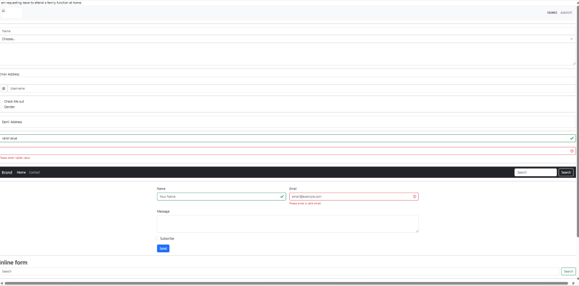
Now let’s take a look at other form elements:
Choose...
One
<textarea class="form-control" rows="4"></textarea>
Why use these classes?
<!-- Input Groups -->
<div class="input-group">
<span class="input-group-text">@</span>
</div>
<!-- Checkboxes and Radio Buttons -->
<div class="form-check">
<label for="checkMe" class="form-check-label">Check Me out</label>
</div>
<!-- Floating Labels -->
<div class="form-floating mb-3">
<label for="floatingInput">Email Address</label>
</div>
Beginner tips:
Example:
<div class="invalid-feedback">Please enter valid value</div>
Note: Bootstrap adds visual feedback with is-valid (green) and is-invalid (red) classes. Always add helpful messages with invalid-feedback tags!
Navigation Bar Structure Breakdown
<nav class="navbar navbar-expand-lg navbar-dark bg-dark">
<div class="container-fluid">
<a class="navbar-brand" href="#">Brand</a>
<button class="navbar-toggler" type="button" data-bs-toggle="collapse" data-bs-target="#navContent">
<span class="navbar-toggler-icon"></span>
</button>
<div class="collapse navbar-collapse" id="navContent">
<!-- Navigation content goes here -->
</div>
</div>
</nav>
How it works:
Grid-Based Form Layout
<div class="col-md-6">
<label for="name" class="form-label">Name</label>
</div>
<div class="col-md-6">
<label for="email" class="form-label">Email</label>
<div class="invalid-feedback">Please enter a valid email.</div>
</div>
Why this rocks:
A. Components / Keywords Used
Name | Description |
navbar | Main navigation bar container |
navbar-brand | Company logo or brand name |
navbar-toggler | Mobile menu toggle button |
collapse | Collapsible content section |
form-control | Styles form inputs consistently |
form-select | Styles dropdown menus |
input-group | Groups input with additional elements |
form-check | Container for checkboxes/radio buttons |
form-floating | Creates floating label effect |
is-valid/is-invalid | Form validation styling |
B. Key Properties / Features
Name | Description |
navbar-expand-lg | Breakpoint when navbar expands |
data-bs-toggle | Enables collapse functionality |
data-bs-target | Links toggle to specific content |
ms-auto/me-auto | Horizontal spacing utilities |
form-label | Properly styles form labels |
invalid-feedback | Displays validation messages |
row g-3 | Grid row with gutter spacing |
col-md-6 | Column that takes half width on medium screens |
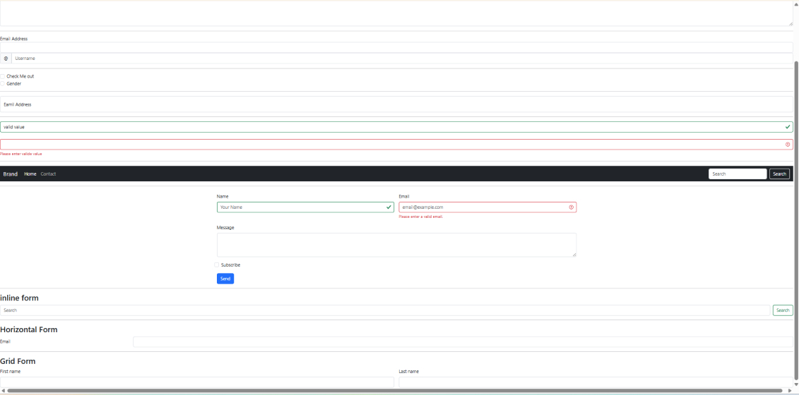
Inline Form
<button class="btn btn-outline-success" type="submit">Search</button>
Horizontal Form
<div class="row mb-3">
<label for="inputEmail" class="col-sm-2 col-form-label">Email</label>
<div class="col-sm-10">
</div>
</div>
Grid Form
<div class="col-md-6">
<label for="firstName" class="form-label">First name</label>
</div>
<div class="col-md-6">
<label for="lastName" class="form-label">Last name</label>
</div>
Keep practicing and keep experimenting! Remember – every great developer was exactly where you’re at now! Happy coding!
Well done! Here’s what you’ve learned today:
Key Takeaways:
Next Steps: Change colors, or add three more menu items, or even just a contact form – using all the elements you’ve learned today!
A Navbar is a responsive navigation header that includes links, logos, dropdowns, and togglers. Bootstrap provides ready-made classes to create mobile-friendly navigation menus.
Bootstrap uses JavaScript to enable dropdown functionality. You add dropdown and dropdown-menu classes to create interactive menus.
Bootstrap Forms provide pre-styled input fields, labels, buttons, validation messages, and layouts to simplify form development.
Bootstrap provides classes like is-valid and is-invalid to display visual feedback for form fields when validation passes or fails.
JavaScript is optional for basic styling but is required for advanced components like validation, dropdowns, and collapses.
3rd Floor, Aval Complex, University Road, above Balaji Super Market, Panchayat Nagar Chowk, Indira Circle, Rajkot, Gujarat 360005.
Abbotsford, BC
15th B Street 103, al Otaiba Dubai DU 00000, United Arab Emirates
3rd Floor, Aval Complex, University Road, above Balaji Super Market, Panchayat Nagar Chowk, Indira Circle, Rajkot, Gujarat 360005.
Abbotsford, BC.
15th B Street 103, al Otaiba Dubai DU 00000, United Arab Emirates.
Copyright © 2026 Niotechone Software Solution Pvt. Ltd. All Rights Reserved.