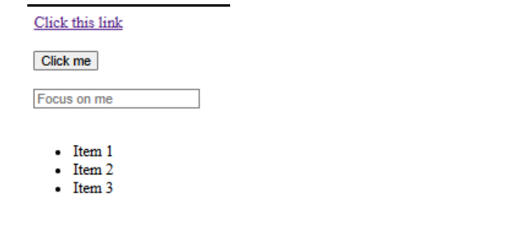
Welcome to the fascinating world of CSS (Cascading Style Sheets)!
Let’s start with an analogy: if you’ve ever built a house, you can think of HTML as the building, with walls, a front door and window, etc. But what makes the house beautiful? The paint color on the walls, decorations, furniture arrangement, and various colors! In the same way, CSS makes a web page look beautiful and professional. CSS will take a boring, plain HTML element and transform it into a beautiful, professional web page design.
Why is CSS, In Particular, Important for Beginners?
In this tutorial, you will become familiar with the basics of CSS: what it is, how to write it, different methods to embed it into your HTML, and how to create interactive styles based on the user’s actions. You will be able to transform plain HTML into beautifully styled web pages!
CSS (Cascading Style Sheets) is a style sheet language used to describe the presentation of HTML elements (e.g., how they should appear on a screen, printout, or other media). It specifies:
Every CSS rule follows this simple structure:
selector {
property: value;
}
Breaking It Down:
Example:
h1 {
color: blue;
font-size: 24px;
}
This applies a blue color and a font size of 24px to all <h1> headings.
Pro Tip: Make sure to always put a semi-colon after every property! Forgetting them is a common new developer mistake!
There are three ways to add CSS to HTML. Let’s take a look at each way!
Method 1: Inline CSS
Inline CSS uses the style attribute directly in an HTML element.
<h1 style="color: red; font-size: 30px;">Hello World</h1>
Pros:
Cons:
Note: Use inline CSS on very specific one-off styles or just to test for now.
Method 2: Internal CSS
Internal CSS is used inside the <style> tags the <head> of your HTML document.
<!DOCTYPE html>
<html>
<head>
<style>
body {
background-color: lightblue;
}
h1 {
color: navy;
text-align: center;
}
</style>
</head>
<body>
<h1>Welcome to CSS</h1>
</body>
</html>
Pros:
Cons:
Note: An internal CSS style is optimal for small projects or if you’d like to keep all of your code in one file.
Method 3: External CSS (BEST PRACTICE!)
External CSS is implemented via a separate .css file, linked to your HTML document. External CSS is the most normal method used by professionals!
HTML File:
<!DOCTYPE html>
<html>
<head>
<link rel="stylesheet" href="Introduction_Basics.css">
</head>
<body>
<h1>Styled with External CSS</h1>
</body>
</html>
CSS File (Introduction_Basics.css):
body {
font-family: Arial, sans-serif;
margin: 20px;
}
h1 {
color: green;
}
Pros:
Cons:
Pro Tip: Always use external CSS for a real assignment, since it is the standard for all professionals!
Comments are valuable because they need to help you (as well as anyone else) to know what you’re trying to do in your code, and browsers will ignore them.
CSS Comment Syntax:
/* This is a single-line comment */
/*
This is a
multi-line comment
for longer explanations
*/
h1 {
color: blue; /* This makes headings blue */
}
When to Use Comments?
Note: Good comments won’t just say what you did, they will say why you made these choices.
Next we will build a complete example that pulls together everything we have learned about CSS, including styles that interact with your page!
Step 1: Create the HTML Structure
Let’s create an HTML file using a number of different elements on our page to style:
<!DOCTYPE html>
<html>
<head>
<link rel="stylesheet" href="Introduction_Basics.css">
</head>
<body>
<a href="#">Click this link</a><br><br>
<button>Click me</button><br><br>
<input type="text" placeholder="Focus on me"><br><br>
<ul>
<li>Item 1</li>
<li>Item 2</li>
<li>Item 3</li>
</ul>
</body>
</html>
What is Happening Here?
Step 2: Styling the Link
Let’s break down each element we styled:
/* Link default state */
a {
color: #3498db;
text-decoration: none;
font-size: 18px;
font-weight: bold;
padding: 10px 15px;
border: 2px solid #3498db;
border-radius: 5px;
transition: all 0.3s ease;
}
Code Explanation:
Pro Tip: The transition property creates smooth animations—it’s a simple way to make your site feel more professional!
Pro Tip: The transition property creates smooth animations, and is a quick way to enhance your site’s professionalism!
Step 3: Adding Hover Effects to the Link
Now, let’s add hover functionality to your link:
/* Link hover state */
a:hover {
background-color: #3498db;
color: white;
transform: scale(1.05);
}
What is a Pseudo-Class?
:hover is a pseudo-class that changes styles based on user hover interaction. It simply provides interactive feedback to your user!
This Code:
Common Mistake: If you forget the colon (:) you will break your code
Step 4: Styling the Button
Let’s create a more-modern and visually appealing button:
/* Button default state */
button {
background-color: #e74c3c;
color: white;
border: none;
padding: 12px 30px;
font-size: 16px;
font-weight: bold;
border-radius: 25px;
cursor: pointer;
box-shadow: 0 4px 6px rgba(0, 0, 0, 0.1);
transition: all 0.3s ease;
}
New Properties Explained:
Note: border-radius: 25px gives the button a pill-shaped button design. You should try different properties and values to see how it alters!
Step 5: Button Hover and Active States
/* Button hover state */
button:hover {
background-color: #c0392b;
transform: translateY(-2px);
box-shadow: 0 6px 8px rgba(0, 0, 0, 0.15);
}
/* Button active state (when clicked) */
button:active {
transform: translateY(0);
box-shadow: 0 2px 4px rgba(0, 0, 0, 0.1);
}
Understanding the Effects:
Hover State:
Active State (:active = as you’re clicking):
Pro Tip: Using the hover and active state together creates a realistic button press!
Step 6: Styling the Input Field
Now let’s make our text input contemporary and intuitive:
/* Input default state */
input[type="text"] {
padding: 12px 15px;
font-size: 16px;
border: 2px solid #bdc3c7;
border-radius: 8px;
width: 300px;
transition: border-color 0.3s ease, box-shadow 0.3s ease;
}
Understanding the Selector:
A Breakdown of the Styles:
Step 7: Input Focus State
When a user clicks on the input field we want to give visual feedback here:
/* Input focus state */
input[type="text"]:focus {
outline: none;
border-color: #3498db;
box-shadow: 0 0 0 3px rgba(52, 152, 219, 0.2);
}
The :focus Pseudo-Class:
This Code:
Accessibility Note: When using outline: none it is a best practice to provide an alternative visual focus indication anywhere that we’ve removed a focus outline (this is the border and shadow)!
Step 8: Styling the List
We are now going to style our unordered list of items so they are nicer visually:
/* List container */
ul {
list-style-type: none;
padding: 0;
width: 300px;
}
/* List items */
li {
background-color: #ecf0f1;
padding: 15px;
margin-bottom: 10px;
border-left: 4px solid #3498db;
border-radius: 4px;
transition: all 0.3s ease;
}
/* List item hover */
li:hover {
background-color: #d5dbdb;
padding-left: 20px;
border-left-color: #2980b9;
}
The Key Concepts:
UL Styles:
LI Styles:
LI Hover:
Pro Tip: Left border accents are a trendy modern design technique used by many professional websites!
This is the full CSS file that brings everything together:
a {
color: #3498db;
text-decoration: none;
font-size: 18px;
font-weight: bold;
padding: 10px 15px;
border: 2px solid #3498db;
border-radius: 5px;
transition: all 0.3s ease;
display: inline-block;
}
a:hover {
background-color: #3498db;
color: white;
transform: scale(1.05);
}
/* Button Styles */
button {
background-color: #e74c3c;
color: white;
border: none;
padding: 12px 30px;
font-size: 16px;
font-weight: bold;
border-radius: 25px;
cursor: pointer;
box-shadow: 0 4px 6px rgba(0, 0, 0, 0.1);
transition: all 0.3s ease;
}
button:hover {
background-color: #c0392b;
transform: translateY(-2px);
box-shadow: 0 6px 8px rgba(0, 0, 0, 0.15);
}
button:active {
transform: translateY(0);
box-shadow: 0 2px 4px rgba(0, 0, 0, 0.1);
}
/* Input Field Styles */
input[type="text"] {
padding: 12px 15px;
font-size: 16px;
border: 2px solid #bdc3c7;
border-radius: 8px;
width: 300px;
transition: border-color 0.3s ease, box-shadow 0.3s ease;
}
input[type="text"]:focus {
outline: none;
border-color: #3498db;
box-shadow: 0 0 0 3px rgba(52, 152, 219, 0.2);
}
/* List Styles */
ul {
list-style-type: none;
padding: 0;
width: 300px;
}
li {
background-color: #ecf0f1;
padding: 15px;
margin-bottom: 10px;
border-left: 4px solid #3498db;
border-radius: 4px;
transition: all 0.3s ease;
}
li:hover {
background-color: #d5dbdb;
padding-left: 20px;
border-left-color: #2980b9;
}
/* Body General Styles */
body {
font-family: 'Segoe UI', Tahoma, Geneva, Verdana, sans-serif;
padding: 40px;
background-color: #f8f9fa; }
The CSS Cascade
CSS is an abbreviation for Cascading Style Sheets. What does “cascading” mean?
The Cascade determines which styles apply to certain elements when multiple rules are applied to the same element. The Cascade has a hierarchy which is as follows (from highest to lowest priority):
Specificity also matters
Pro Tip: More specific selectors will override other selectors regardless of their order
Pseudo-class Explained
Pseudo-classes select an element based on its state or position – not just its type or class.
Common Pseudo-Classes:
Pseudo-Class | When It Applies |
:hover | When cursor is over element |
:focus | When element is selected/active |
:active | When element is being clicked |
:visited | For links that have been clicked |
:first-child | First element among siblings |
:last-child | Last element among siblings |
:nth-child(n) | nth element among siblings |
Why pseudo-classes are great:
Pseudo-classes allow you to create interactive experiences without using any JavaScript! Hover effects, focus, and active states can all enhance the experience of use and provide visual feedback.
Understanding Transitions
The transition property produces smooth animations between states:
transition: property duration timing-function delay;
Our Example:
transition: all 0.3s ease;
You may also transition specific properties:
transition: background-color 0.5s, transform 0.3s;
“`
Pro Tip: Utilize transitions on interactive elements (buttons, links, inputs) to create a polished truer UX!
### Box Model and Spacing
Every HTML element is a rectangular box organized by these layers:
Note: Padding grows the element’s size, margin creates space between items!
A. Components / Keywords Used
Name | Description |
<link> | HTML tag that connects external CSS file to HTML document |
rel=”stylesheet” | Attribute specifying the relationship as a stylesheet |
href | Attribute pointing to the CSS file location |
<style> | HTML tag for internal CSS within the document head |
selector | Targets which HTML element(s) to apply styles to |
property | The aspect of styling to change (color, size, etc.) |
value | The specific setting for a property |
/* comment */ | CSS comment syntax for code documentation |
:hover | Pseudo-class that applies styles when cursor hovers over element |
:focus | Pseudo-class for styling elements when selected/active |
:active | Pseudo-class for styling elements during click |
a | Element selector targeting all anchor/link tags |
button | Element selector targeting all button elements |
input[type=”text”] | Attribute selector targeting specific input types |
ul | Element selector for unordered lists |
li | Element selector for list items |
rgba() | Color format with red, green, blue, and alpha (transparency) |
#hexcode | Color format using hexadecimal notation |
transition | Property for smooth animations between states |
transform | Property for moving, scaling, or rotating elements |
B. Key Properties / Parameters / Features
Name | Description |
color | Sets text color |
background-color | Sets background color of element |
font-size | Controls text size |
font-weight | Controls text thickness (normal, bold, 100-900) |
font-family | Specifies typeface/font to use |
text-decoration | Controls text underlines, overlines, strikethroughs |
padding | Space inside element between content and border |
margin | Space outside element creating gaps between elements |
border | Edge of element with width, style, and color |
border-radius | Rounds corners of elements |
border-left | Style only the left border (also: top, right, bottom) |
width | Sets element width |
height | Sets element height |
display | Controls how element is rendered (block, inline, flex, etc.) |
cursor | Changes cursor appearance when hovering |
box-shadow | Creates shadow effects around elements |
outline | Border-like outline that doesn’t affect layout |
list-style-type | Controls bullet point style in lists |
text-align | Aligns text (left, center, right, justify) |
transition | Defines smooth animations between property changes |
transform | Applies 2D/3D transformations (scale, rotate, translate) |
scale() | Transform function that resizes elements |
translateY() | Transform function that moves elements vertically |
ease | Timing function for natural-feeling animations |
none | Value that removes or disables a property |
inline-block | Display value combining inline and block characteristics |
Official Documentation & Standards
Learning Platforms
CSS Properties & Values
Selectors & Specificity
Colors & Design
Transitions & Animations
Practice & Challenges
Tools & Utilities
Video Tutorials
Books & Guides
Communities & Help
Source Code:
Congratulations! You’ve made it through your first day of CSS and made a huge leap in your web development journey!
Key Takeaways:
1. CSS Fundamentals
2. Three Ways to Add CSS
3. Interactive Styling
4. Modern Design Techniques
5. Practical Skills
6. Best Practices
A class selector can be used multiple times on a page, while an ID selector is unique and should be used only once. Classes are more flexible for styling repeated elements.
Yes. CSS is used to style HTML elements, so understanding basic HTML structure helps you apply CSS more effectively.
Common reasons include incorrect file path for the CSS file, missing <link> tag, typos in selectors, or browser caching. Refreshing the page or checking the path usually fixes it.
Yes, you can link multiple CSS files using multiple <link> tags. This helps you organize styles—such as separating layout, components, and utilities.
The universal selector applies styles to every element on the page. It’s often used for resetting margins and padding.
Copyright © 2025 Niotechone Software Solution Pvt. Ltd. All Rights Reserved.