Complete Guide: Login & Registration System with Bootstrap 5

Introduction:

Welcome to this beginner-friendly tutorial! Today, we’re going to build a Login and Registration System using HTML5 and Bootstrap 5. This project demonstrates how to create professional-looking authentication forms—the gateway to most web applications.

Why is this important? Well, almost every website you visit has a login page. Understanding how to build these forms teaches you:

  • Basics of form handling – Data collection of the user.
  • Bootstrap framework – building responsive, beautiful UIs quickly
  • Modal dialogs – Building the popup windows to enhance the UX.
  • Validity of form – is that the user is putting in the correct information?

By the end of this tutorial, you’ll have a fully functional (front-end) authentication system that you can customize and expand for your own projects!

What We're Building

Our project consists of three pages:

  1. Login Page – Where users enter credentials
  2. Registration Modal – A full-screen popup for new user signup
  3. Home Page – A welcome page with logout functionality

Let’s build this step by step!

Step-by-Step Tutorial

Step 1: Setting Up the HTML Structure

First, let’s create the basic HTML structure and link Bootstrap:

🌐
filename.html
<!DOCTYPE html>
<html lang="en">
<head>
    <meta charset="UTF-8" />
    <meta name="viewport" content="width=device-width, initial-scale=1.0" />
    <title>Login & Registration</title>
    <link href="https://cdn.jsdelivr.net/npm/bootstrap@5.3.2/dist/css/bootstrap.min.css" rel="stylesheet" />
    <link href="https://cdn.jsdelivr.net/npm/bootstrap-icons@1.10.5/font/bootstrap-icons.css" rel="stylesheet" />
    <script src="https://cdn.jsdelivr.net/npm/bootstrap@5.3.2/dist/js/bootstrap.bundle.min.js"></script>
</head>
<body class="bg-primary p-4">
    <!-- Content will go here -->
</body>
</html>

What’s happening here?

  • The <meta charset> provides an appropriate encoding of characters to any language.
  • The viewport meta tag is what causes our page to make the page responsive in mobile devices.
  • We are loading BootstrapCSS to style and Bootstrap Icons to be beautiful icons.
  • The Bootstrap JavaScript file provides the interactivity of such components as modals.
  • class=”bg-primary p-4″ gives our page a blue background with padding

Pro Tip: Always load CSS in the <head> and JavaScript before the closing </body> tag for better performance!

Step 2: Creating the Login Form

Now let’s build the login card:

🌐
filename.html
<div class="container">
    <div class="row justify-content-center">
        <div class="col-md-5">
            <div class="card p-4 shadow-lg border-0 rounded-4">
                <h3 class="text-center mb-3 text-primary">
                    <i class="bi bi-shield-lock-fill"></i> Login
                </h3>

                <form action="homeboot.html">
                    <div class="mb-3">
                        <label class="form-label">
                            <i class="bi bi-person-circle"></i> Username or Email
                        </label>
                        <input type="text" class="form-control" placeholder="Enter Username or Email" required>
                    </div>

                    <div class="mb-3">
                        <label class="form-label">
                            <i class="bi bi-key-fill"></i> Password
                        </label>
                        <input type="password" class="form-control" placeholder="Enter Password" required>
                    </div>

                    <button class="btn btn-primary w-100" type="submit">Login</button>

                    <p class="text-center mt-3">
                        Don't have an account?
                        <a href="#" data-bs-toggle="modal" data-bs-target="#registerModal">Register</a>
                    </p>
                </form>
            </div>
        </div>
    </div>

</div>

Breaking it down:

  • Container and Grid System: Bootstrap has a container and row/col system that provides a responsive layout that is centered.
  • Card Component: The card component is a clean white box with shadow-lg to give it depth and rounded-4 to give it rounded-edges.
  • Structural Formatting: mb-3 (margin-bottom) is used to space each input.
  • Icons: Bootstrap Icons (bi bi-person-circle) allow visual compellingness of the form.


Input Attributes: 

  • type=”text” for username field
  • type= password conceals password characters.
  • required makes sure that users can not submit empty forms.
  • Modal Trigger: The data-bs-toggle=”modal” and data-bs-target=”#registerModal” attributes open the registration popup when clicked

Note: The action=homeboot.html is used to redirect the user to the home page on the successful completion of the login. You would actually attach this to a server in a real application!

Step 3: Building the Registration Modal

Modals are popup windows that appear over the main content. Let’s create a full-screen registration modal:

🌐
filename.html
<div class="modal fade" id="registerModal" tabindex="-1" aria-labelledby="registerModalLabel" aria-hidden="true">

    <div class="modal-dialog modal-fullscreen modal-dialog-centered modal-dialog-scrollable">
        <div class="modal-content">

            <div class="modal-header justify-content-center position-relative">
                <h3 class="modal-title text-primary" id="registerModalLabel">
                    <i class="bi bi-person-lines-fill me-2"></i>Registration
                </h3>
                <button type="button" class="btn-close position-absolute end-0 me-3" data-bs-dismiss="modal" aria-label="Close"></button>
            </div>
            <div class="modal-body">
                <form action="log_reg_boot.html" oninput="satisfaction.value = satisfactionRange.value">
                    <!-- Form fields will go here -->
                </form>
            </div>
      </div>
    </div>
</div>

Key concepts:

  • Modal Structure: There are three areas of bootstrap modals: modal-header, modal-body and potentially modal-footer. 
  • Fullscreen Modal: Setting modal-fullscreen will open a modal that takes over the full screen on all devices.
  • Scrollable Content: The modal-dialog-scrollable class gives users a way to scroll the modal contents in the case of really long contents.
  • Accessibility: aria-labelledby and aria-hidden are really useful attributes to include for screen reader functionality. 
  • Close Button: Set attributes data-bs-dismiss=”modal” to close the modal.
  • Dynamic Output: Use on input to dynamically update the user’s satisfaction value in user interface while the user drags the slider.

Pro Tip: Always include proper ARIA attributes for accessibility—it makes your site usable for everyone!

Step 4: Adding Registration Form Fields

Inside the modal body, we’ll add various input types:

Personal Information Fields

🌐
filename.html
<div class="row g-3">
    <div class="col-md-4">
        <label class="form-label"><i class="bi bi-person-vcard-fill me-1"></i>First Name</label>
        <input type="text" class="form-control" placeholder="Enter first name" required>
    </div>
    <div class="col-md-4">
        <label class="form-label"><i class="bi bi-person-vcard-fill me-1"></i>Last Name</label>
        <input type="text" class="form-control" placeholder="Enter last name" required>
    </div>
    <div class="col-md-4">
        <label class="form-label"><i class="bi bi-envelope-at-fill"></i>Email</label>
        <input type="email" class="form-control" placeholder="Enter email" required>
    </div>
</div>

What’s new here?

  • Grid Gutters: g-3 adds consistent spacing between columns
  • Responsive Columns: col-md-4 means each field takes 4/12 (33.33%) width on medium+ screens, but stacks on mobile
  • Email Validation: type=”email” automatically validates email format

Password Fields

🌐
filename.html
<div class="col-md-4">
    <label class="form-label"><i class="bi bi-key-fill"></i> Password</label>

    <input type="password" class="form-control" placeholder="Enter Password" required>

</div>
<div class="col-md-4">
    <label class="form-label"><i class="bi bi-shield-lock-fill"></i> Confirm Password</label>
    <input type="password" class="form-control" placeholder="Confirm Password" required>
</div>

Security Note: In production, you’d add JavaScript to verify both passwords match before submission!

Textarea for Address

🌐
filename.html
<div class="col-md-4">
    <label class="form-label"><i class="bi bi-geo-alt-fill"></i>Address</label>
    <textarea name="address" class="form-control" placeholder="Enter Address"></textarea>
</div>

Why textarea? Unlike <input>, <textarea> allows multiple lines of text—perfect for addresses!

Radio Buttons for Gender

🌐
filename.html
<div class="col-md-4">
    <label class="form-label"><i class="bi bi-gender-ambiguous"></i> Gender</label>
    <div class="d-flex gap-3">
        <div><input type="radio" name="gender" value="male"> Male</div>
        <div><input type="radio" name="gender" value="female"> Female</div>
        <div><input type="radio" name="gender" value="other"> Other</div>
    </div>
</div>

Radio buttons explained:

  • All radio buttons must share the same name attribute so only one can be selected
  • value determines what data is sent when the form submits
  • d-flex gap-3 displays them horizontally with spacing


Dropdown Selects (Country, State, City)

🌐
filename.html
<div class="col-md-4">
    <label class="form-label"><i class="bi bi-globe me-1"></i>Country</label>

    <select class="form-select">
        <option selected disabled>Select Country</option>
        <option>India</option>
        <option>Brazil</option>
        <option>Australia</option>
        <!-- More options -->
    </select>
</div>

Select dropdown tips:

  • selected disabled on the first option creates a placeholder that can’t be reselected
  • In real apps, you’d populate these dynamically from a database
  • Consider using a cascading system where State options change based on selected Country


Special Input Types

🌐
filename.html
<div class="col-md-4">
    <label class="form-label"><i class="bi bi-telephone me-1"></i>Phone</label>
    <input type="tel" class="form-control" placeholder="Enter phone number" required>
</div>
<div class="col-md-4">
    <label class="form-label"><i class="bi bi-calendar-event me-1"></i>Date of Birth</label>
    <input type="date" class="form-control">
</div>
<div class="col-md-4">
    <label class="form-label"><i class="bi bi-globe-central-south-asia me-1"></i>Website</label>
    <input type="url" class="form-control" placeholder="https://example.com">
</div>
<div class="col-md-4">
    <label class="form-label"><i class="bi bi-clock-history me-1"></i>Contact Time</label>
    <input type="time" class="form-control">
</div>
<div class="col-md-4">
    <label class="form-label"><i class="bi bi-calendar3 me-1"></i>Birth Month</label>
    <input type="month" class="form-control">
</div>

HTML5 input types are powerful!

  • type=”tel” – Optimized keyboard on mobile for phone numbers
  • type=”date” – Native date picker calendar
  • type=”url” – Validates URL format (must start with http:// or https://)
  • type=”time” – Time picker (hours and minutes)
  • type=”month” – Month and year selector


Checkboxes for Hobbies

🌐
filename.html
<div class="col-md-4">
    <label class="form-label"><i class="bi bi-person-hearts me-1"></i>Hobby</label>
    <div class="d-flex gap-3 pt-1">
        <div><input type="checkbox" name="hobby" value="reading"> 📖 Reading</div>
        <div><input type="checkbox" name="hobby" value="coding"> 💻 Coding</div>
        <div><input type="checkbox" name="hobby" value="dance"> 💃 Dance</div>
    </div>
</div>

Checkboxes vs Radio Buttons:

  • Radio: Only one selection allowed (gender)
  • Checkbox: Multiple selections allowed (hobbies)
  • Notice we use emojis (📖💻💃) to make it fun and visual!


Range Slider with Live Output

🌐
filename.html
<div class="col-md-4">
    <label class="form-label">
        <i class="bi bi-emoji-smile-fill me-1"></i>Satisfaction:
        <output name="satisfaction">5</output>/10
    </label>
    <input type="range" id="satisfactionRange" min="1" max="10" value="5" class="form-range">
</div>

How the range slider works:

  • The oninput=”satisfaction.value = satisfactionRange.value” in the <form> tag updates the <output> element in real-time
  • min=”1″ and max=”10″ set the range bounds
  • value=”5″ sets the default position
  • class=”form-range” styles it with Bootstrap


Design Tip
: Interactive elements like sliders improve user engagement!

File Upload with Preview

🌐
filename.html
<div class="col-md-4">

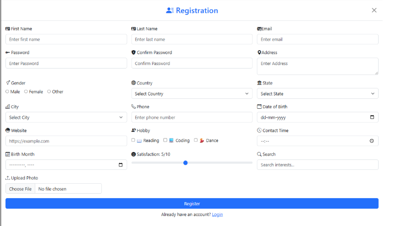
    <label for="photo" class="form-label"><i class="bi bi-upload"></i> Upload Photo</label>

    <div class="d-flex align-items-center gap-2">

        <div class="flex-grow-1">

            <input type="file" id="photo" class="form-control" accept=".png, .jpg, .jpeg" style="max-width: 350px;">

            <div id="fileType" class="invalid-feedback">Please upload a valid photo (PNG, JPG, JPEG, max 100MB).</div>

        </div>

        <img id="preview" class="img-thumbnail d-none" style="width: 60px; height: 60px; object-fit: cover;">

    </div>

</div>

File upload features:

type=”file” generates a file picker

accept=”.png, .jpg, .jpeg” constricts file types that can be uploaded

The  with d-none is hidden by default—JavaScript would handle showing a preview after upload

invalid-feedback provides error messages (this requires JavaScript validation)

Note: To make the preview happen, you’d need JavaScript to read the file type and display it in the  instead!

Search Input

🌐
filename.html
<div class="col-md-4">
    <label class="form-label"><i class="bi bi-search me-1"></i>Search</label>
    <input type="text" class="form-control" placeholder="Search interests...">
</div>

This is a simple text input for searching—you could use type=”search” for a styled search box with a clear button in some browsers!

Submit Button and Login Link

🌐
filename.html
<div class="col-md-12">
    <button type="submit" class="btn btn-primary w-100">Register</button>
</div>

<div class="text-center mt-2">
    Already have an account?
    <a href="#" data-bs-dismiss="modal">Login</a>
</div>

w-100 makes the button full-width for better mobile experience

  • data-bs-dismiss=”modal” closes the registration modal and returns to the login page

Step 5: Creating the Home Page (After Login)

After users log in, they see a welcome page:

🌐
filename.html
<!DOCTYPE html>
<html lang="en">
<head>
  <meta charset="UTF-8" />
  <meta name="viewport" content="width=device-width, initial-scale=1" />
  <title>Home Page</title>
  <link href="https://cdn.jsdelivr.net/npm/bootstrap@5.3.0/dist/css/bootstrap.min.css" rel="stylesheet" />
  <script src="https://cdn.jsdelivr.net/npm/bootstrap@5.3.2/dist/js/bootstrap.bundle.min.js"></script>
  <link href="https://cdn.jsdelivr.net/npm/bootstrap-icons@1.10.5/font/bootstrap-icons.css" rel="stylesheet" />
</head>
<body class="bg-primary">
  <div class="d-flex vh-100 justify-content-center align-items-center">
    <div class="container">
      <div class="card mx-auto text-center shadow" style="max-width: 500px;">
        <div class="card-body p-5">
          <h1 class="card-title display-5 fw-bold text-primary">Welcome, User!</h1>
          <p class="card-text lead">We're glad to have you here.</p>         
          <div class="mt-4">
             <a href="log_reg_boot.html" class="btn btn-outline-primary">
               <i class="bi bi-box-arrow-in-left"></i> Logout
             </a>
          </div>
        </div>
      </div>
    </div>
  </div>
</body>
</html>

Components of Page Structure:

Flexbox Centering: d-flex vh-100 justify-content-center align-items-center are classes defined to create a center for layout that is vertical and horizontal.

vh-100 is a class that allows the container to equal 100% of viewport height.

Typography Classes:

  • display-5 creates large display typography for headings
  • fw-bold makes it bold text
  • lead is the class we use for prominent body text
  • Logout Button: btn-outline-primary are classes to design a bordered button style button to hold the icon.


Pro Tip:
In a production setting (clicking logout is in theory supposed to clear relevant session data, then it would “redirect” back to the login page!)

Code Explanation: Key Sections

1. Bootstrap Grid System

🌐
filename.html
<div class="container">
    <div class="row justify-content-center">
        <div class="col-md-5">
            <!-- Content →
        </div>
    </div>
</div>

Bootstrap implements a 12-column system: 

  • container creates responsive fixed width 
  • row creates a group of columns horizontally 
  • col-md-5 creates 5 out of 12 columns (41.67% width) in the medium and larger screen size ranges. 
  • justify-content-center will center columns horizontally.


2. Form Validation with HTML5

🌐
filename.html
<input type="email" class="form-control" placeholder="Enter email" required>

HTML5 has built-in validation: 

  • required forbids submissions with empty forms 
  • type=”email” will ensure the submitted email is in the correct format 
  • type=”url” will ensure the submitted url is in the correct format 
  • Web browsers will show up with auto generated error messages! 


Advanced Tip:
Provide custom validation through Javascript and add Bootstrap’s .was-validated class for a better UX! 

3. Bootstrap Modal JavaScript

🌐
filename.html
<a href="#" data-bs-toggle="modal" data-bs-target="#registerModal">Register</a>

Bootstrap JavaScript makes modals work without any written code: 

  • data-bs-toggle=”modal” requires opening a modal 
  • data-bs-target=”#registerModal” requires a named modal 
  • data-bs-dismiss=”modal” requires dismissing a modal 


How it works behind the scenes:
Bootstrap listens for when the browser detects a click on the element with data-bs-toggle, finds the target modal with the target id, and adds and removes css classes to show/hide and apply the transition! 

4. Dynamic Form Output

🌐
filename.html
<form oninput="satisfaction.value = satisfactionRange.value">
    <output name="satisfaction">5</output>
    <input type="range" id="satisfactionRange" min="1" max="10" value="5">
</form>

Integration with Javascript: 

  • The oninput event fires every time any input in the form changes
  • It updates the value of the <output> element with the current value of the range slider
  • This gives you instant feedback without writing any additional javascript!

Tables: Key Components & Features

1. Components & Keywords Used

Component/Element

Description

<form>

Container for collecting user input data

<input>

Single-line input fields for various data types

<textarea>

Multi-line text input for longer content

<select>

Dropdown menu for choosing from options

<button>

Clickable element to submit forms or trigger actions

<label>

Descriptive text for form inputs (improves accessibility)

<output>

Displays the result of a calculation or user input

<i>

Icon element (using Bootstrap Icons library)

.modal

Bootstrap component for popup dialog boxes

.card

Bootstrap component for content containers with borders

.form-control

Bootstrap class for styling input fields

.btn

Bootstrap class for styled buttons

.container

Bootstrap class for responsive fixed-width container

.row

Bootstrap grid row container

.col-md-*

Bootstrap responsive column classes

2. Key Properties, Attributes & Bootstrap Classes

Property/Attribute

Description

type=”email”

Validates email format automatically

type=”password”

Hides input characters for security

type=”date”

Provides a native date picker calendar

type=”range”

Creates a slider for selecting numeric values

type=”file”

Allows users to upload files from their device

required

Makes a field mandatory before form submission

placeholder

Shows hint text inside empty input fields

data-bs-toggle

Bootstrap attribute to trigger components (modals, dropdowns)

data-bs-target

Specifies which element to show/hide

data-bs-dismiss

Closes/dismisses Bootstrap components

accept

Limits file types for file inputs

oninput

JavaScript event that runs when input value changes

.bg-primary

Applies Bootstrap’s primary blue background color

.shadow-lg

Adds a large shadow for depth

.rounded-4

Applies medium border radius for rounded corners

.w-100

Makes an element 100% width

.vh-100

Sets height to 100% of viewport height

.d-flex

Enables flexbox layout

.justify-content-center

Centers flex items horizontally

.align-items-center

Centers flex items vertically

.gap-3

Adds spacing between flex/grid items

.mb-3

Adds bottom margin (spacing)

.mt-4

Adds top margin (spacing)


Useful References & Learning Resources

Official Documentation:

Practice & Learning:

Design Inspiration:

Source Code – Complete Login  Registration form using Html and Bootstrap:

Completion

The Login and Registration System with Bootstrap 5 teaches the basics of form design, layout and validation in a responsive manner. You’ve learnt the use of Bootstrap components and HTML5 features to create clean, professional authentication pages. The tutorial is focused on the front end, but you can effortlessly build it up with backend logic and database to make it a fully functional application. With this project, you will have the skills to develop secure and user-friendly web applications that are ready for the real world.

Output

Frequently Asked Questions FAQs

A Login and Registration System enables an individual to establish an account (sign up), and then, later, securely access that account (sign in) using the user’s credentials (an email address or username and a password). The process of a login and registration system is, arguably, one of the central features of most web application systems to authenticate users for a personalized user experience.

Bootstrap 5 makes it much easier to implement a responsive web design using pre-built components and a modern grid system and mobile-first utilities. Developers can build professional-looking login and registration forms that will respond to any size screen with minimal coding in CSS.

Yes, if we want to make the forms functional. The Bootstrap 5 framework creates the frontend UI, while a backend language (such as PHP, Node.js, Python, or .NET) and database (such as MySQL or SQL Server) would be used to store the user’s credentials and manage verification for authenticating access to the account.

Client-side validation occurs within the browser (using HTML5 or JavaScript) to validate basic input errors before submitting the form.

Validation on the server side is done on the back-end to verify the integrity of the data and to prevent security issues, such as SQL injection. You would want your secure system to incorporate both methodologies.

You should never store plain-text passwords. Make sure to hash all passwords with secure algorithms like bcrypt or Argon2 (which securely hash the password prior to storing it in the database, making it almost impossible to crack or decode, even if the hacker got access to the database).